


 As the U.S. economy starts to recover from the pandemic, certain economic indicators are starting to emerge.
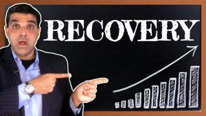
Low wage earners and middle income earners in restaurants, travel, entertainment and hotels have suffered the most devastating impact, and many jobs are unlikely to return. In this video, Dr. Nitin Chhoda analyzes 5 economic charts that are mostly linked to the worst-hit industries – restaurants, air travel, direction requests, hotel occupancy and home buying. We examine economic recovery and the future of jobs in America.
Some encouraging signs are emerging. Home purchases are up compared to last year, reservations are increasing at restaurants and hotel occupancy rates are on the rise. It appears, based on early indicators, that the the worst might be over for the U.S. economy.
The five charts in the video illustrate this progress as the economy recovers from one of the most significant downturns in history.
In this video, we explore:
1. What State Re-openings Look Like
2. FIVE Economic Charts That Track Recovery
3. What This Means For You
We look at current trends in the following states:
California
New York
New Jersey
Pennsylvania
Texas
Florida
For specific trends and updates in your state, check out:
https://www.washingtonpost.com/graphics/2020/national/states-reopening-coronavirus-map/
https://www.nytimes.com/interactive/2020/us/states-reopen-map-coronavirus.html
Related Playlists:
Managing your Money Crash Course
Unemployment Benefits Crash Course
References:
https://www.washingtonpost.com/graphics/2020/national/states-reopening-coronavirus-map/
https://www.nytimes.com/interactive/2020/us/states-reopen-map-coronavirus.html
https://www.cnbc.com/2020/06/14/five-charts-that-track-economic-recovery-in-the-us.html